
Of everything we help clients with, colour is the decision that causes the most sleepless nights. It feels permanent, it's everywhere at once, and a shade that looked perfect on a tiny paint chip can feel completely wrong on four walls. The good news is that a beautiful, cohesive home isn't about getting one brave colour right. It's about building a palette properly, and that follows a few simple principles.
Start with a base, not an accent
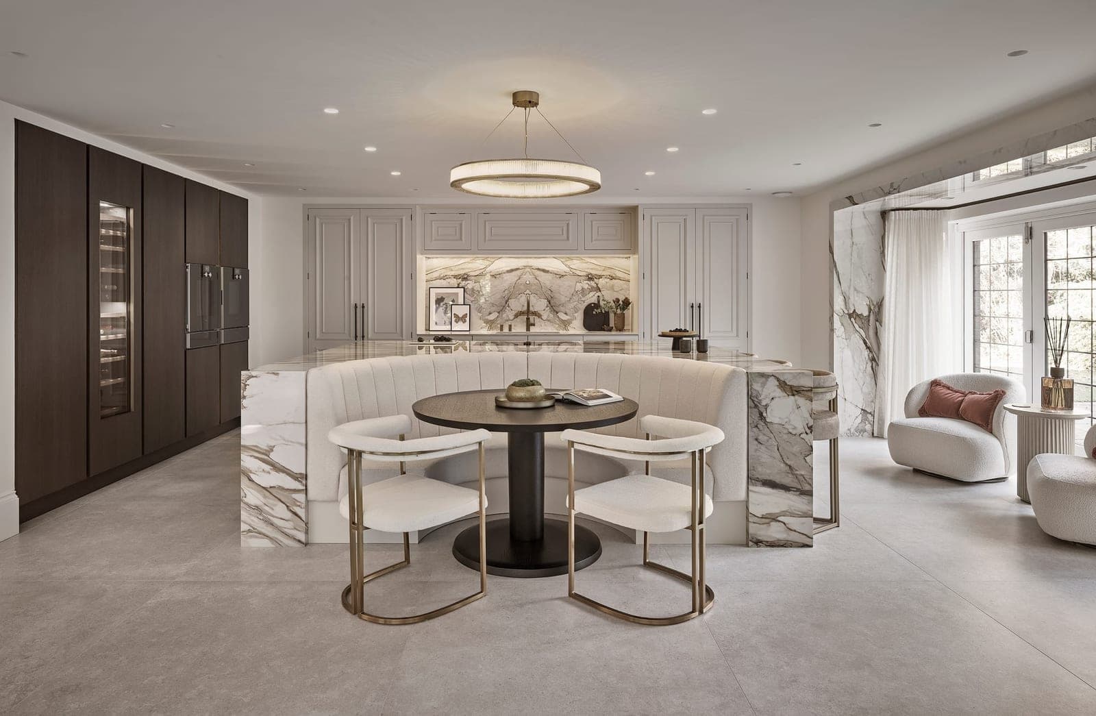
The most common mistake is leading with the exciting colour, the bold blue or the deep green, and trying to build around it. Do it the other way around. Start with your base: the warm whites, soft stones, putty and natural timber tones that will run through most of the home. Get that foundation calm and cohesive, and everything you add afterwards has somewhere settled to sit.
A beautiful home isn't about getting one brave colour right. It's about building the whole palette properly.
Learn to see undertones
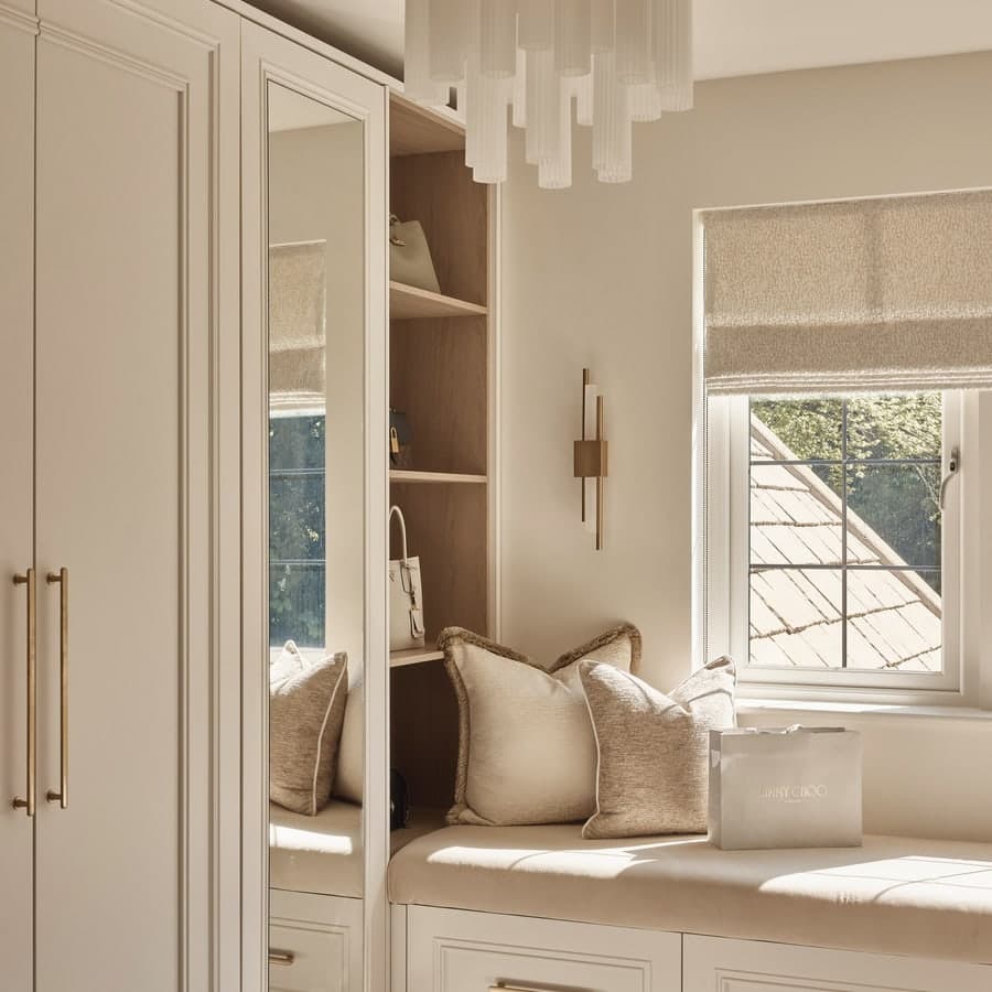
This is the thing that separates a scheme that feels effortless from one that feels slightly "off." Every neutral has an undertone, warm (pink, yellow, red) or cool (blue, green, grey), and the trouble starts when you mix them without realising. A warm-white trim next to a cool-grey wall will always look a little uncomfortable, even if you can't put your finger on why. Pick a temperature for your home and stay loyal to it.
Let the light make the decision
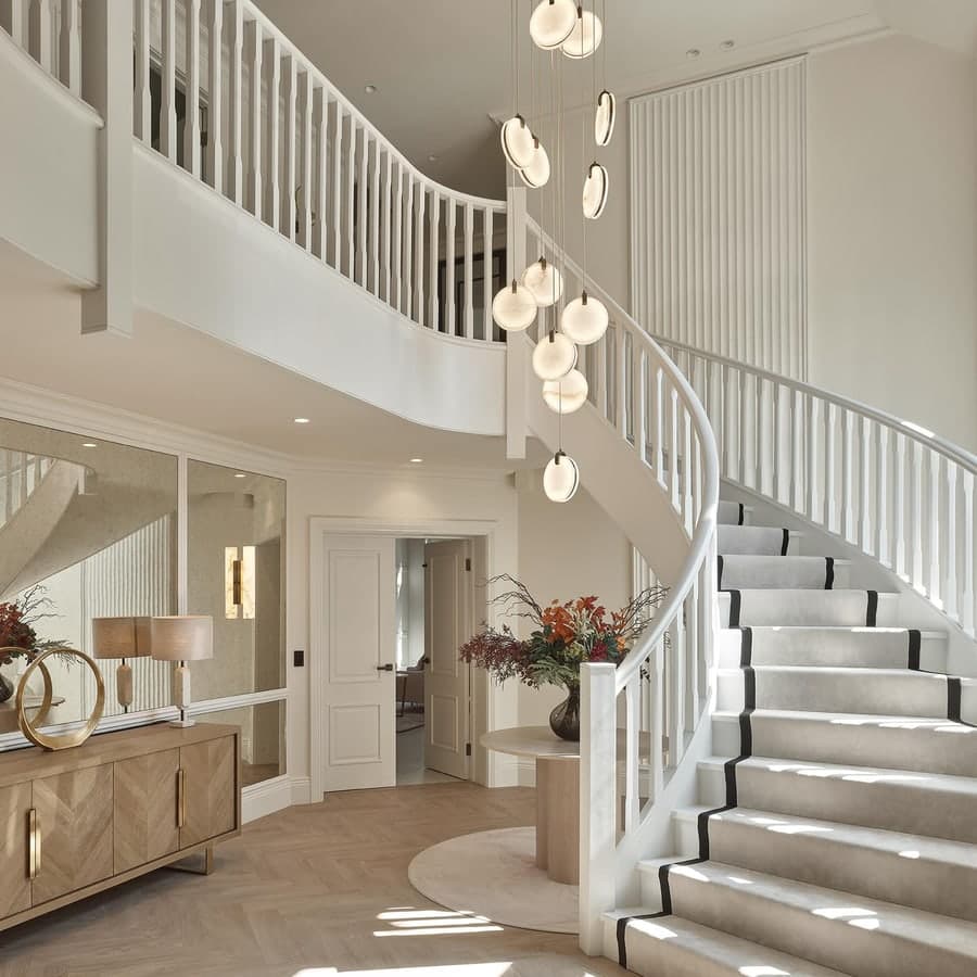
The same colour will look like two different shades in a north-facing room and a south-facing one. North light is cooler and flatter, so warm tones stop it feeling cold; south light is warm and generous, so it can carry cooler, more restful shades beautifully. Before you fall for a colour, find out which way your room faces, it changes everything.
Think in proportions
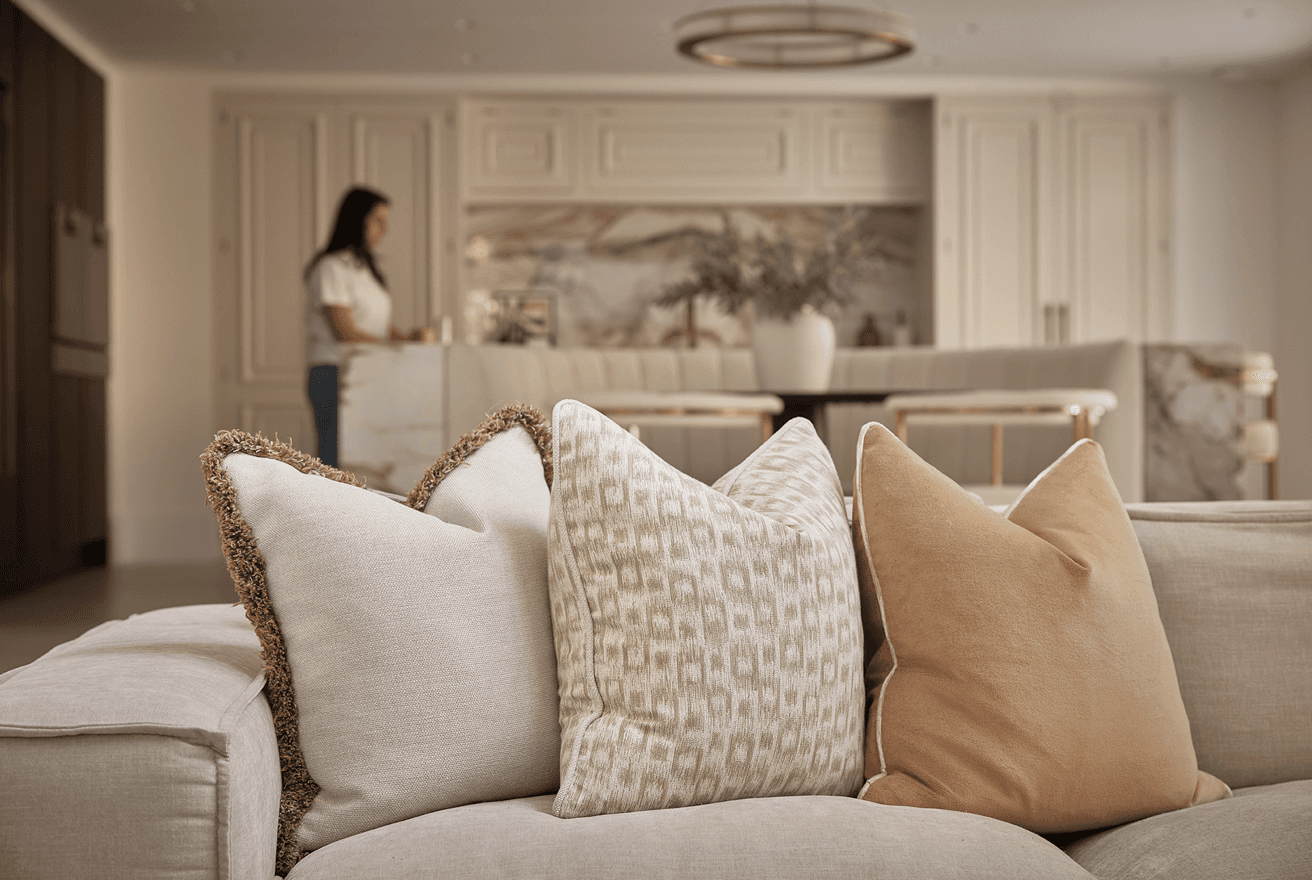
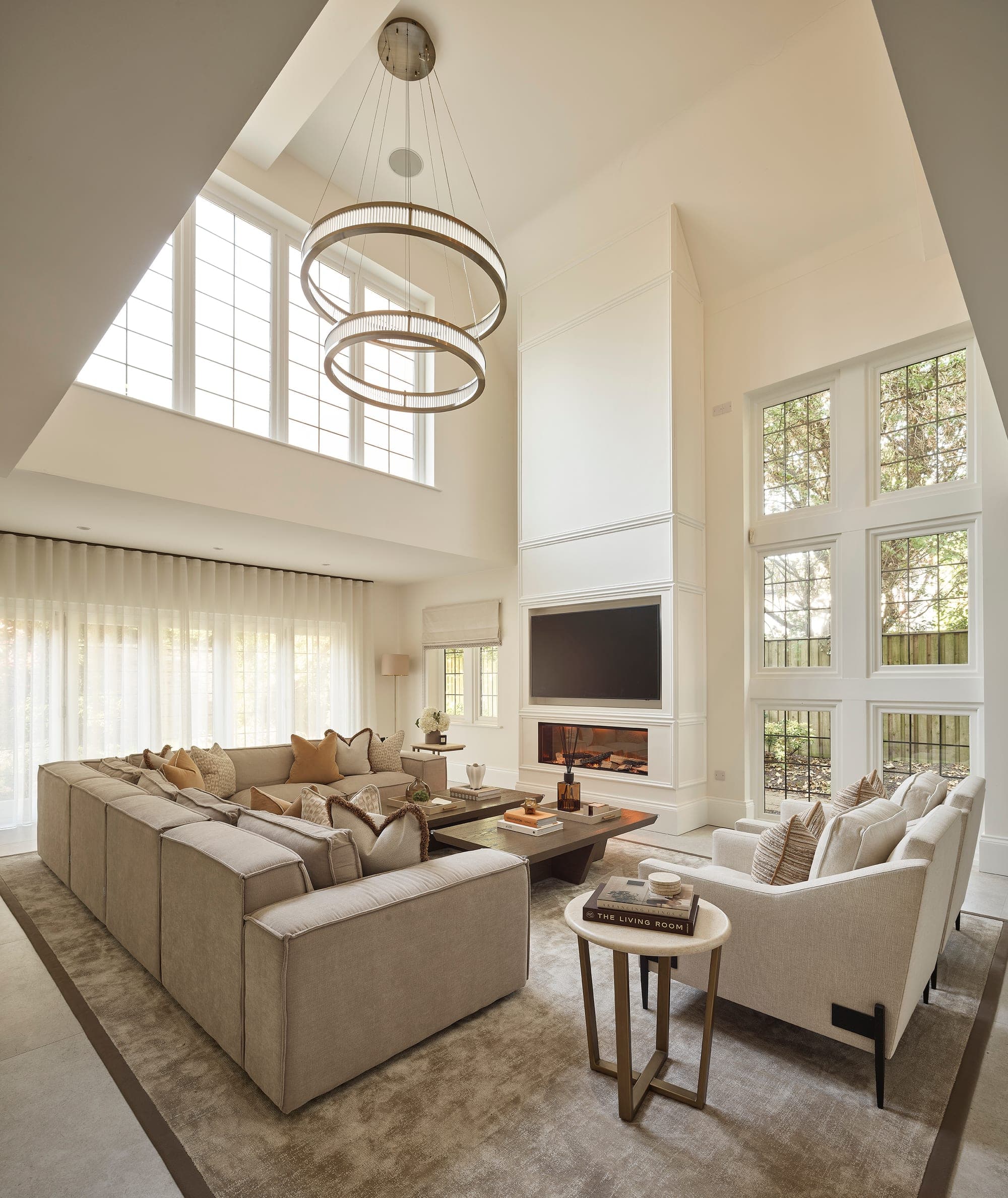
A useful rule of thumb: roughly 60% of a room in your main base tone, 30% in a secondary colour or material, and 10% in an accent. It stops a scheme feeling either flat or chaotic. You don't need to measure it with a ruler, but keeping that rough balance in mind is the easiest way to make a room feel considered.
Add colour with confidence, not caution
When you do bring in colour, commit to it. The timid approach, a slightly different beige here, a hint of grey-blue there, is what makes a home feel undecided. One well-chosen colour, used properly, does far more than three half-hearted ones. Pick the shade you genuinely love and let it earn its place.
Let materials and texture do some of the work
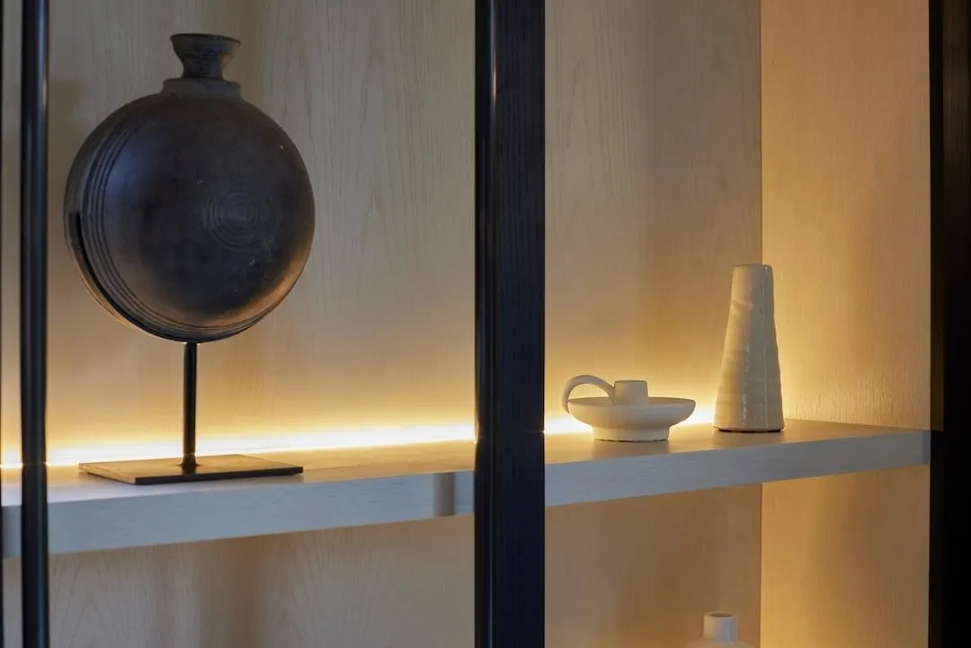
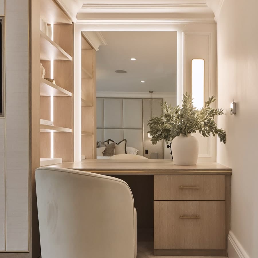
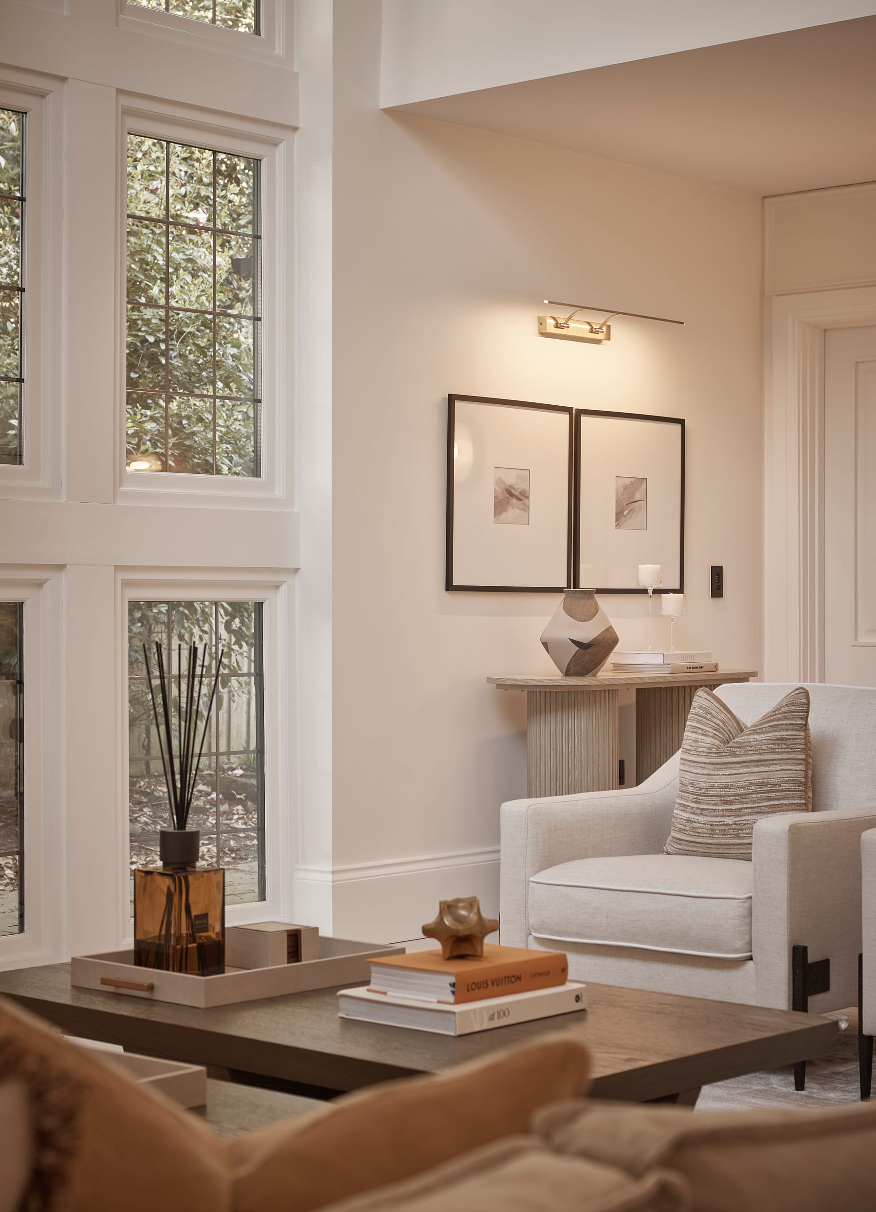
Colour doesn't only come out of a paint tin. The warmth of oak, the depth of natural marble, the softness of a bouclé or a wool, all of these bring colour and tone to a room in a way that feels richer and more lasting than paint alone. In a calm, tonal home, texture is often where the real interest lives.
Always, always test at home
Never commit to a colour from a screen or a showroom. Get the largest samples you can, paint them onto board, and live with them in the actual room, in the morning, at midday and at nine o'clock at night under the lamps. It takes a little patience, but it's the only way to be truly sure, and it will save you from the most expensive mistake of all: doing it twice.
If you'd love a calm, cohesive home but the idea of pulling it all together feels daunting, that's exactly what we're here for. Get in touch to talk through your project, wherever you are in Cheshire.